.png?width=202&height=60&name=Fishbowl%20by%20GoTab%20Logo%20(1).png)
Clicking on a content element in the editing area on the left (i.e. an image or text area) will make the content panel switch to content properties mode, so you can change the settings of that particular content block. If you click outside of a content element, instead, the row in which the content element is located will be selected and its properties will be available (more on this under rows below).
The content properties area changes depending on the content element that has been selected.
If you select a button, for example, you will see a number of tools to help you style the button and link it to your desired action (open a web page, send an email, make a phone call from a mobile device, etc.). In the example shown below, for instance, the “Reservations” button has been selected.
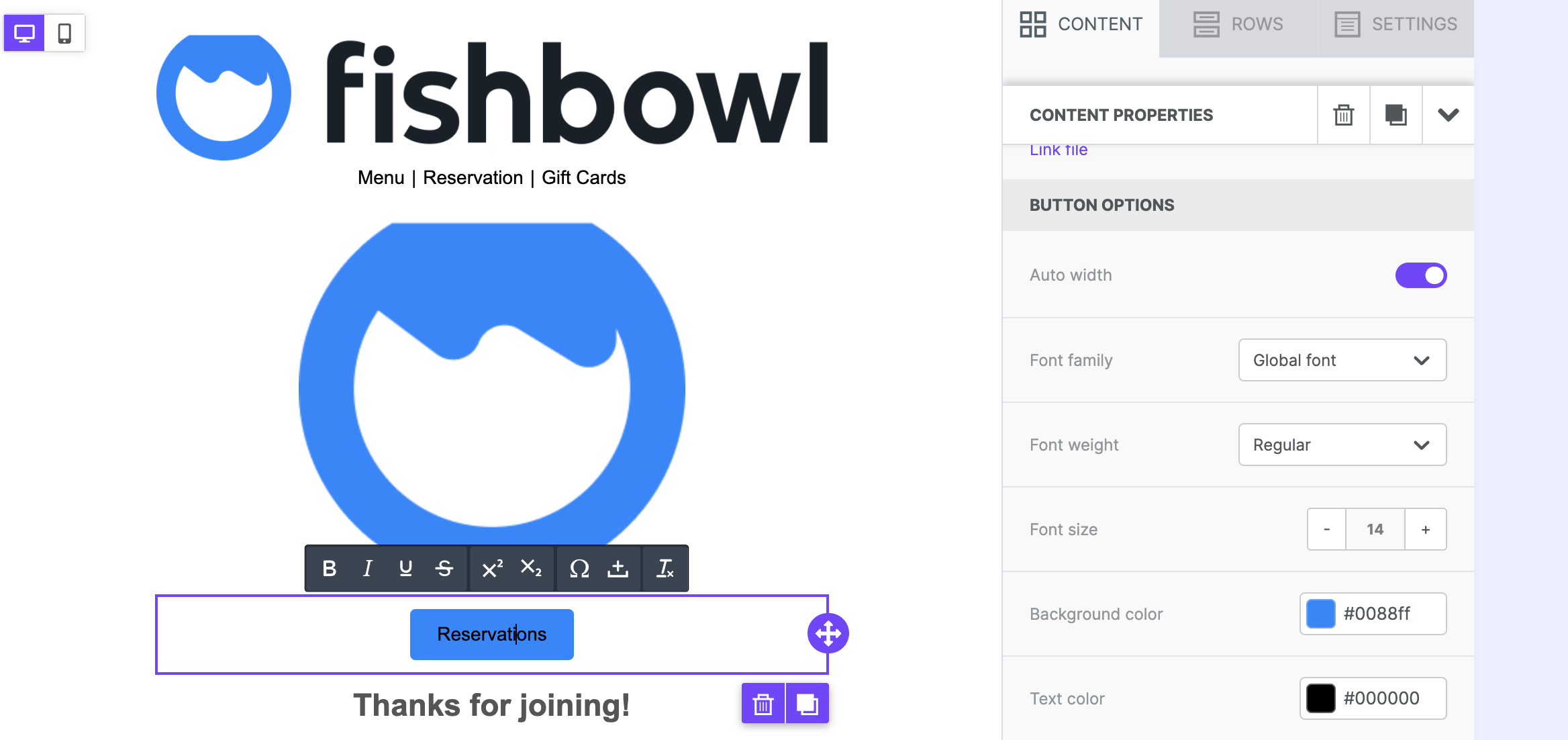
The content switches to button mode and allows you to set the button’s width, background color, text color, alignment, the roundness of the corners, padding around the text, etc. When the content properties panel is longer than the height of the screen, a scroll bar appears on the right side.
With buttons as well as many other content items, the editor gives you great control of the design of your mailings. Some of the controls, including content padding and borders, have both a simple editing mode – where only one setting is shown – and an advanced editing mode, where more control is provided (e.g. specifying padding for the four sides of the object independently of each other).
The content properties panel displays different controls depending on which content element you selected. Here is a description of some of the most frequently used ones.
- Padding: Padding settings can be configured both for all sides of the selected element or separately for each side.
- Borders: Border settings can be configured both for all sides of the selected element or separately for each side of a button, column, etc.
- Dividers: Dividers help create a visual separation between design elements. They can be transparent or visible. Here too, granular control on padding provides great design flexibility.